We got loads of inspiration from the DC Design House this year and thought it might be fun to highlight very specific details that caught our eye! So here goes.
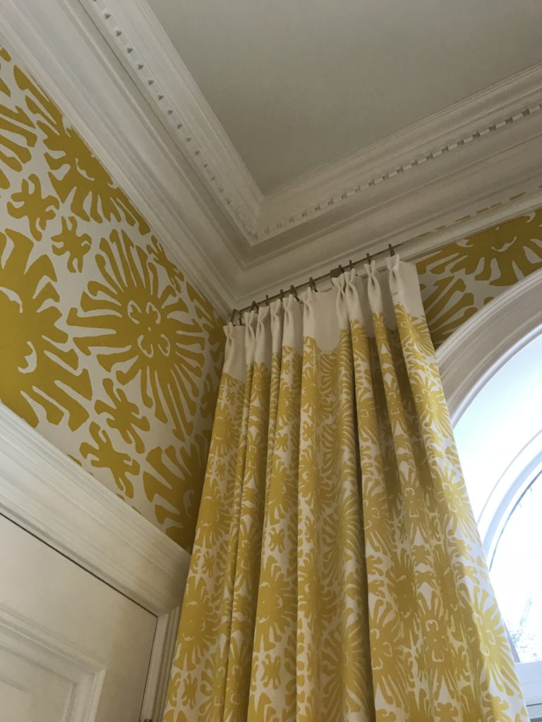
Check out this clear acrylic curtain rod installed just under the crown moulding. Your eye is not interrupted by a metal or wood rod and instead it appears as though the fabric is floating. Very pretty!
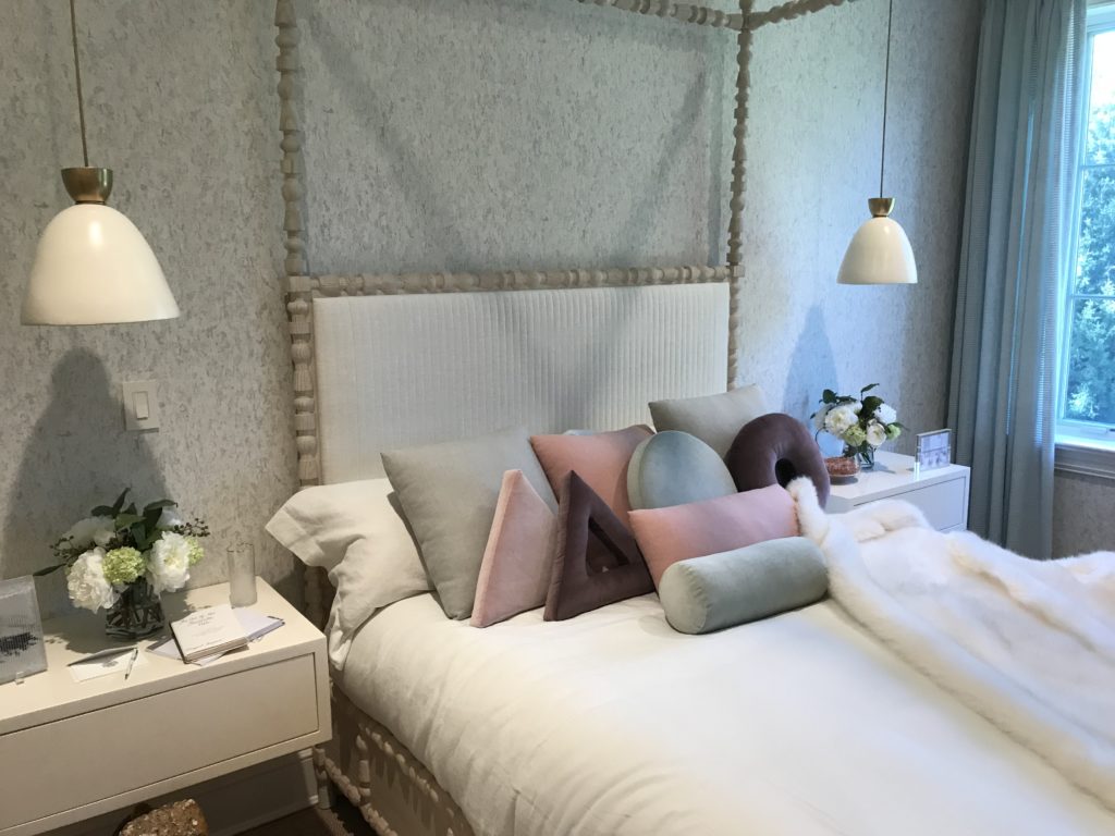
Below, the designer specified pendants to be hung over the nightstands, which frees up the surface area for flowers and other essentials!
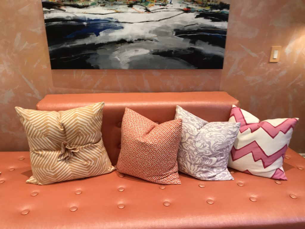
This is a custom paint treatment on the wall, with a large painting placed over it, and we love the simplicity and colorful nature of this entire tableau, including the pillows.
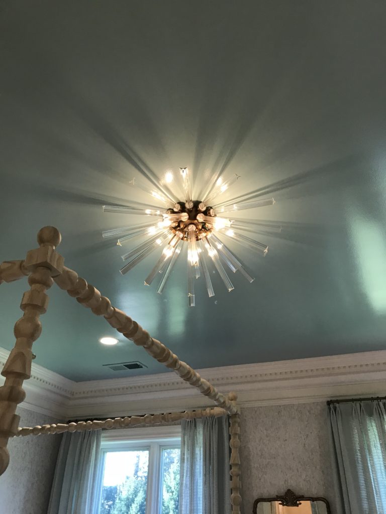
An unexpected and modern light captivates you from the moment you walk into the bedroom pictured below.
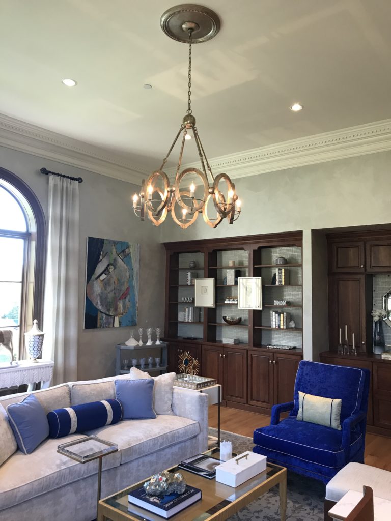
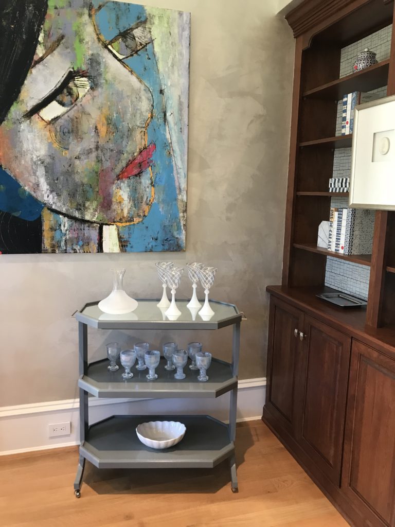
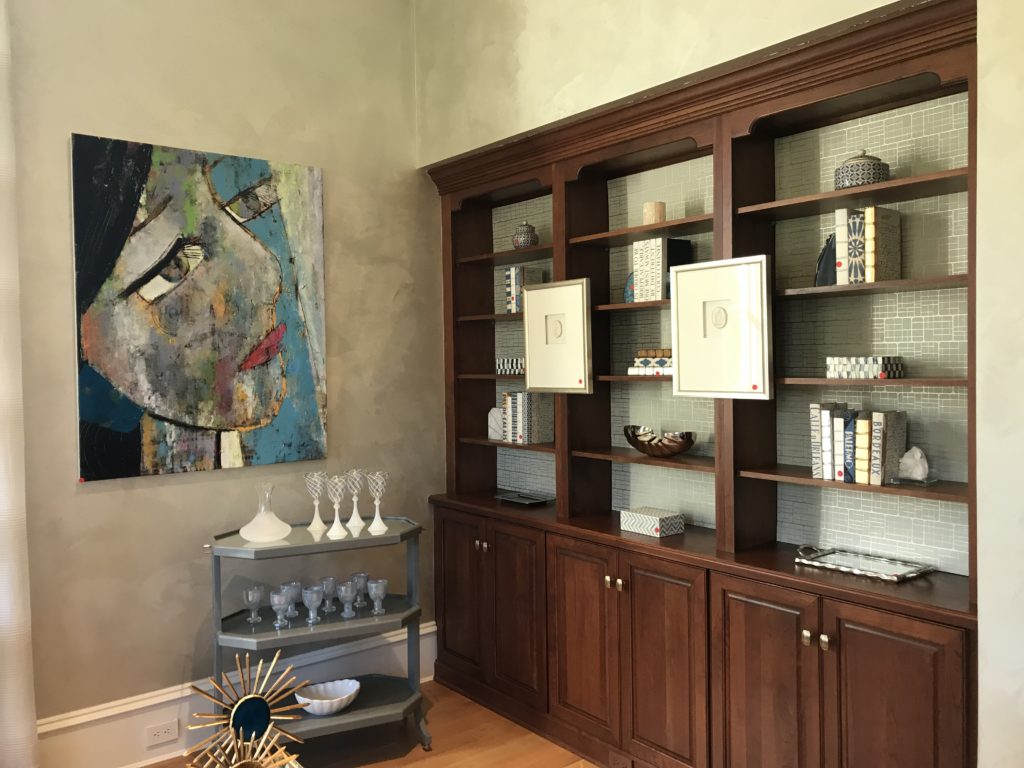
This lovely library was one of our favorite rooms in the house. She chose interesting artwork, placed wallpaper panels along the back of the built-ins to break up the dark wood, and used smaller works of art to add further interest along the front of the built-in bookcase wall.
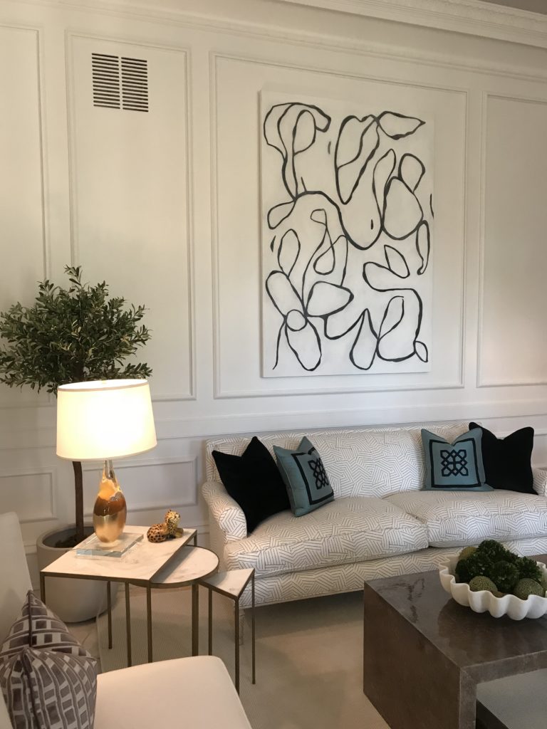
Using a black and white piece of modern art mounted within traditional trim is eye catching!
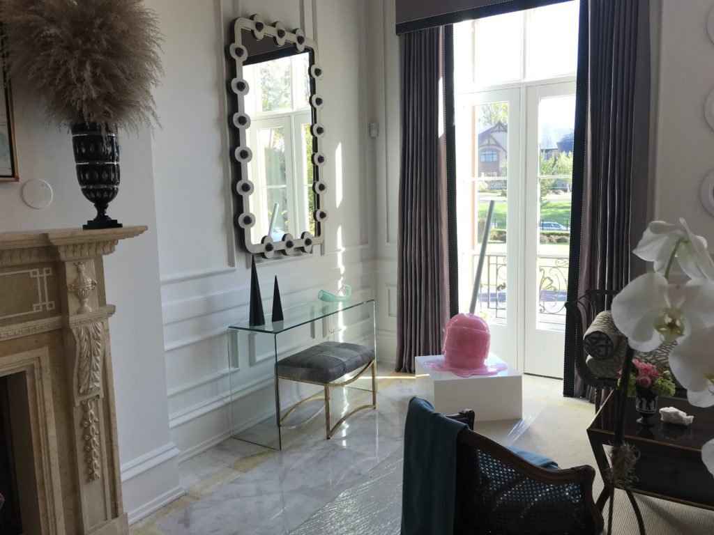
A clear table allows the eye to travel to the melting lollipop art!
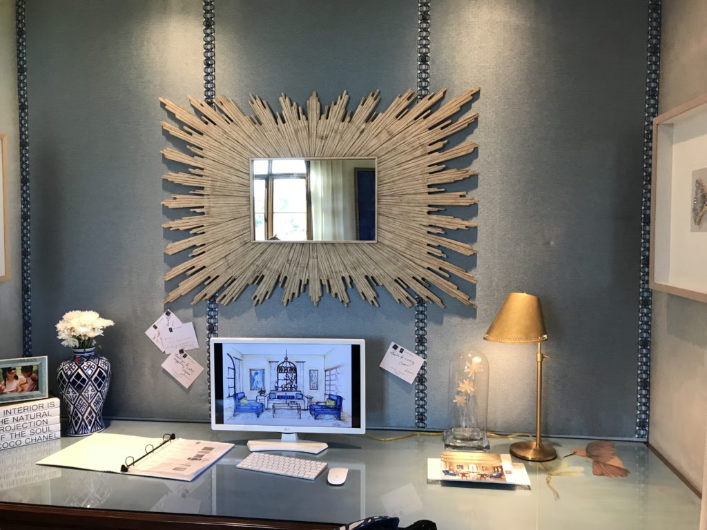
Below is a custom pin that fills the entire wall over a large desk. The designer dressed it up with trim and then centered a mirror on top. The entire thing is well lit and such a welcoming place to work! She also installed a glass piece for the entire surface of the desk and laid a piece of art underneath, but that can be switched out for pretty fabric or anything else. Cool idea!
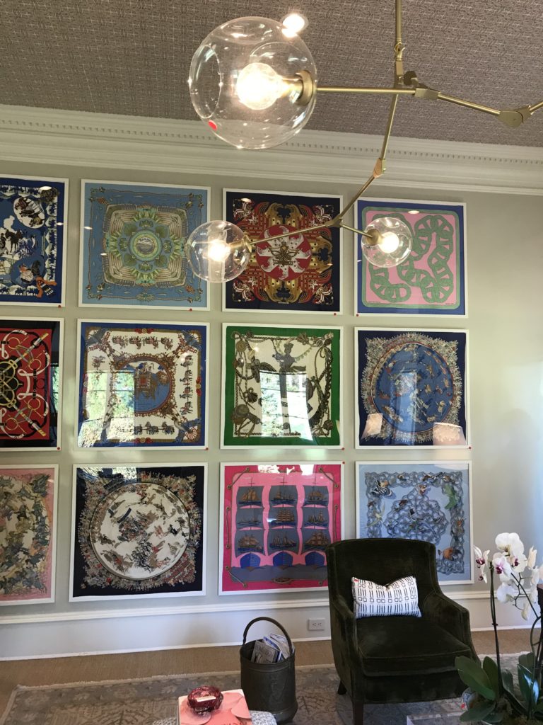
This new designer took a series of Hermes scarves and had them framed and installed in a grid. You can do this with favorite photographs or album covers, or really any collection of favorite things.
